
In a recent tweet, designer @WiseArts shared a brilliantly simple pricing interface that’s been getting well-deserved attention. It’s a variation on the classic “Good, Fast, Cheap — pick two” model, but it’s applied with creative clarity and a modern UI flair.
Good, fast, cheap. PICK TWO.https://t.co/eWGXKuPhX9 pic.twitter.com/ZXfMswSOrx
— Rachelle Wise (@WiseArts) June 28, 2025
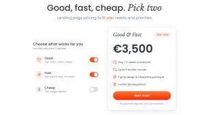
The screenshot she shares is from onepageflip.com/#pricing, a landing page design service.
Why This “Pick Two” Interface Works So Well
The interface itself offers three benefits:
- 🧠 Knowledge
- 💸 Low cost
- 🕐 Time
And then comes the catch: Pick two
It’s a small twist on a familiar idea, but in this context it accomplishes a lot:
- Sets expectations: transparently shows the trade-offs involved
- Filters buyers: encourages self-selection based on priorities
- Builds trust: feels honest and human, not like sales copy
- Feels modern: clean UI, a touch of humor and no feature bloat
It’s effective because it tells a story in one glance. A SaaS product could use this same approach to clarify positioning, defuse objections or streamline onboarding. Especially for products with complexity, tiering or multiple buyer personas.
How SaaS Companies Could Use a “Pick Two” Pricing Model
To illustrate how this might work in real life, we decided to apply it to a handful of well-known SaaS brands. Here’s how it worked out:
🛠 1. Notion – Personalization, Collaboration, Simplicity
Pick 2:
- 🧩 Deep customization
- 🧑🤝🧑 Team workflows
- ✨ Minimalist simplicity
How it might work:
Notion attracts both individuals who care about elegance and teams that care about functionality. This kind of pricing guidance could steer users toward the right plan:
- “Customization + Teamwork” → Business plan
- “Simplicity + Customization” → Personal Pro
- “Simplicity + Teamwork” → Plus plan with templates
📈 2. HubSpot – Price, Power, Speed
Pick 2:
- 💸 Affordable pricing
- 🚀 Fast results
- 🏗 Enterprise-grade features
How it might work:
HubSpot often walks a line between serving SMBs and large orgs. A “pick two” interface would clarify that if you’re seeking power and speed, it comes at a cost. Or if you’re budget-focused, you may need to forgo real-time automation or custom objects.
This could be an effective conversation starter for agency partners, onboarding teams or pricing calculators.
✍️ 3. Jasper AI – Insight, Speed, Affordability
Pick 2:
- 🧠 Insightful content
- 🕐 Instant turnaround
- 💵 Low cost
How it might work:
AI tools often get trapped between promising too much and disappointing on quality. A pick-two prompt here would frame expectations honestly:
- Insight + Speed = high-cost, premium plan
- Insight + Low Cost = templated generation, slower delivery
- Speed + Low Cost = basic outputs, limited nuance
Jasper could use this not just on a pricing page but in the signup flow to guide buyers and preempt “meh” reviews.
Why SaaS Teams Should Steal This Pattern
The “Pick Two” pricing UI from onepageflip.com works because it’s human. It makes invisible trade-offs visible. It lets buyers articulate what they actually want. And it builds trust by saying: you can’t have everything, but we’ll help you get what matters most.
As SaaS companies evolve from feature lists to experience frameworks, these kinds of visual tools can help streamline decision-making, highlight differentiators, reinforce brand voice and increase conversion.
Pricing isn’t just about numbers anymore. It’s about clarity. And this little interface is a masterclass in that.